UX Design & Prototyping For InkTank’s “Connecting with Artists” Feature
Project Overview:
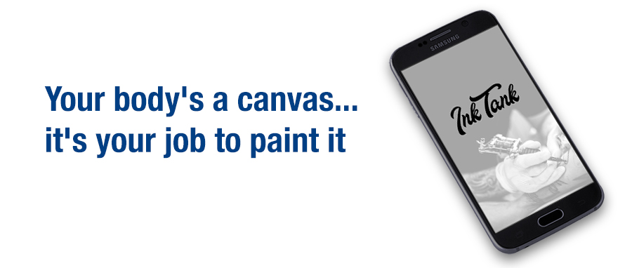
InkTank is a mobile tattoo app designed to help people search for tattoo inspiration, find tattoo artists in their area, chat with them and book appointments.
Project Type:
CareerFoundry
UX Design Certification
Tools Used:
Usability Hub
OptimalSort
Balsamiq
Adobe XD
My Role:
User Research
Information Architecture
UX/UI Design
The Problem:
Our tattoo app users need a way to take more control of the design, placement and execution of their tattoo because most people can’t draw their own tattoo, can’t visualize where it should go or what size it should be and don’t know who to go to in order to get their ideal tattoo.
The Solution:
An app that allows users to create their own tattoo design using royalty-free images that they can customize using different tattoo techniques (make it black and white, shaded, watercolor, etc.). Once happy with the design, they can use our camera/AR to superimpose the tattoo onto their body to be sure they are happy with it and try different placements. The app will then suggest artists local to them that can give them exactly what they want. The user will be able to see the artist’s previous work, ratings/reviews, choose who they would like to work with and be given a way to contact the artist.

Define
When I started working on this project, I had no idea that tattoo apps existed, though I suppose I should have, since there seems to be an app for everything! Before creating my app, I wanted to see what was out there in order to get a feel for what has already been done and what was missing. I knew that I wanted to make my app easy to use, include a way for people to “try” the tattoo on different parts of the body, give users a way to create their own design, regardless of their artistic abilities and find an artist nearby who can recreate the style and design.
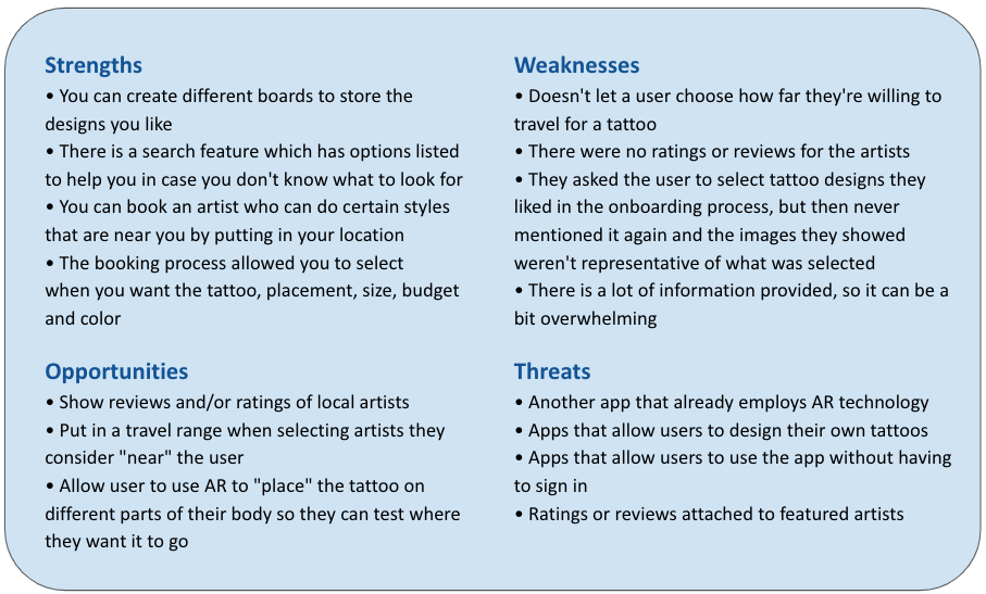
I began by doing a competitive and SWOT analysis of other tattoo apps already on the market. This allowed me to see what the potential competition of my app would be as well as find weaknesses within other apps of features that I could improve upon.
During my research phase, I set the target audience to be between 20-30 years old, as that’s the age that’s more apt to use apps and social media. My target audience are people who want to create their own tattoo designs, but don’t have the artistic ability to draw one themselves. They also want something that’s easy to use and isn’t complicated.
Competitive Analysis Conclusion:
Offering a tattoo design app that allows a user to see reviews and ratings of a tattoo artist located close to the user as well as offering a way to create their own tattoo and try it on will be key in making our app stand out from others. Adding AR technology, to allow the user to “try” on their tattoo, gives people the power to make informed decisions before being permanently inked. Good marketing will be very important as there are already some really good, highly-regarded tattoo apps out there.
“I have an idea in my head and I use Pinterest and Google to form what I’m looking for”
User Surveys and Interviews:
In order to get both quantitative and qualitative data, I conducted 20 user surveys and four user interviews. My goal was to find out how people find tattoo designs that they like, whether or not they’d like to design their own tattoo and how they go about finding a good tattoo artist.
The most important finding I made is that people do not use tattoo apps. When I asked why, all of my interviewees said they had no idea they existed. They said they would be apt to use them now that they know about them, which leads me to believe they are helpful, but need to be marketed more. Instead, most of my participants used Google, or Pinterest to find inspiration. Not surprisingly, being able to review a tattoo artist’s portfolio was a high priority in choosing an artist. I was surprised to learn that reviews weren’t as important to one of my interviewees. She stated that anyone can have a bad day and she would be more apt to make her decision based on the portfolio than just reviews alone (unless they got less than three total stars, that is!).
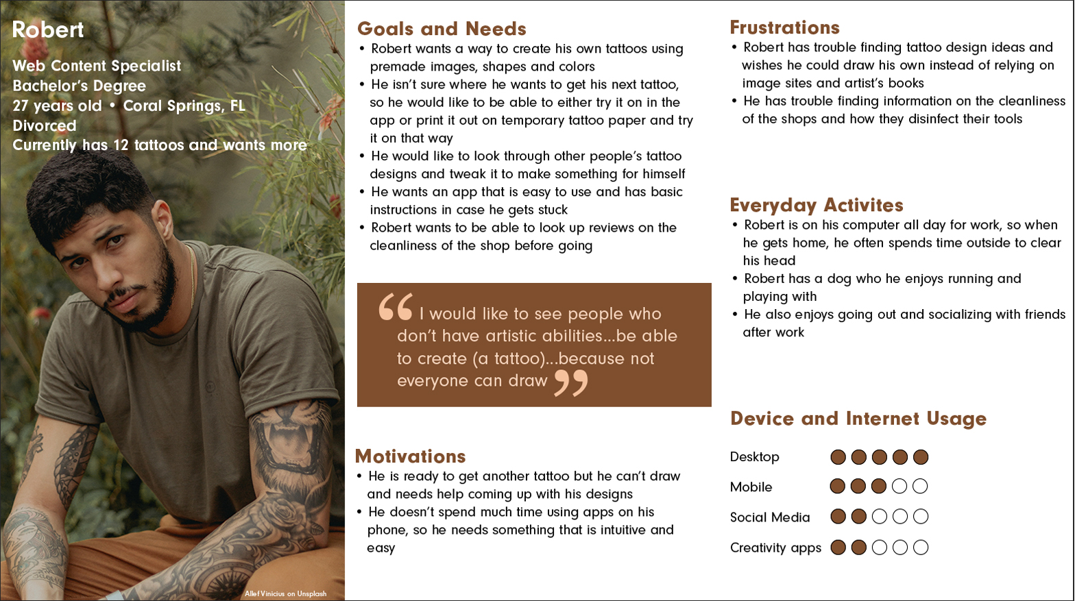
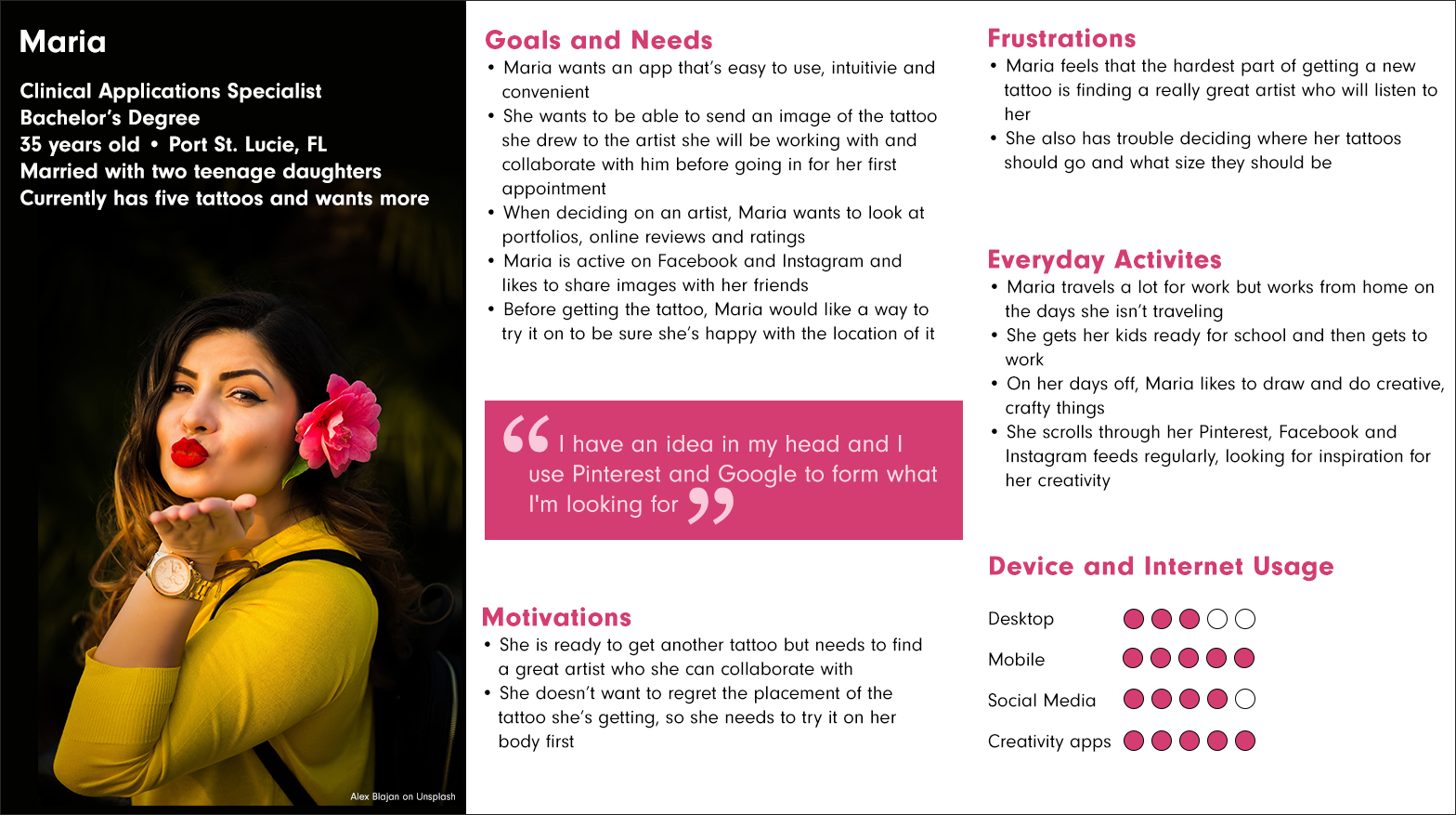
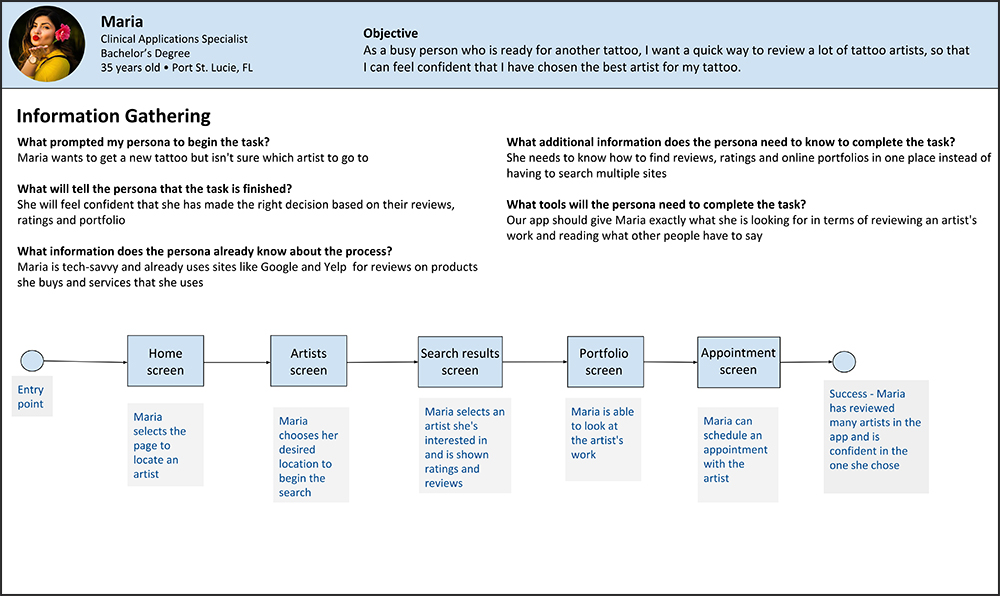
User Personas
From that data that I collected during my survey/interview phase, I created two user personas; Robert and Maria.
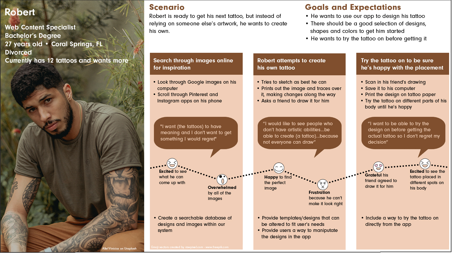
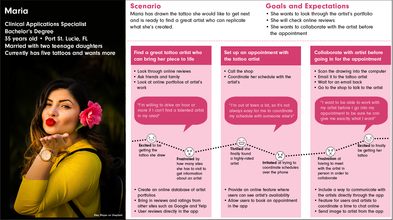
User Journeys
To get an idea of what my users’ paths through the app would be, I created user journeys for both Robert and Maria.

Ideate
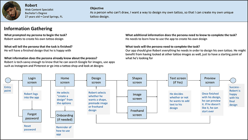
User Flows

Card Sorting
I used OptimalSort to conduct an open card sort for the InkTank app. I recruited the help of friends as well as fellow students via Slack.
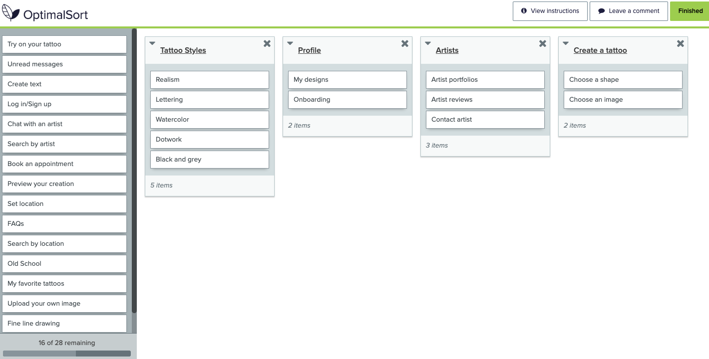
Five people completed the study, which was open for three days. 80% of people were from the United States, with the other 20% being from Germany. I chose to do an open card sort in order to see if there was a better way for me to categorize my topics than the names I had chosen. It took a median time of 5:32 to complete the study.
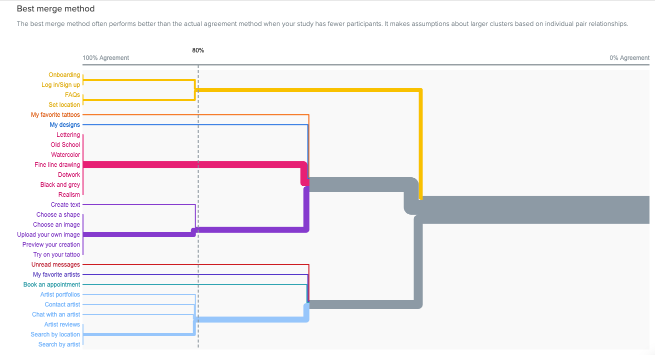
Using the dendrogram, I was able to find four clear groupings for my site map. Since there isn’t a consensus on some of the outlying topics, I will place them in groups that make the most sense to me.

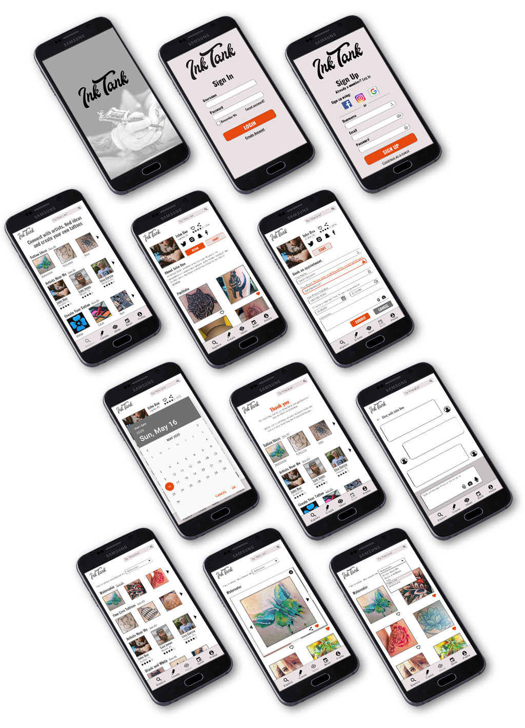
Wireframes and Prototypes
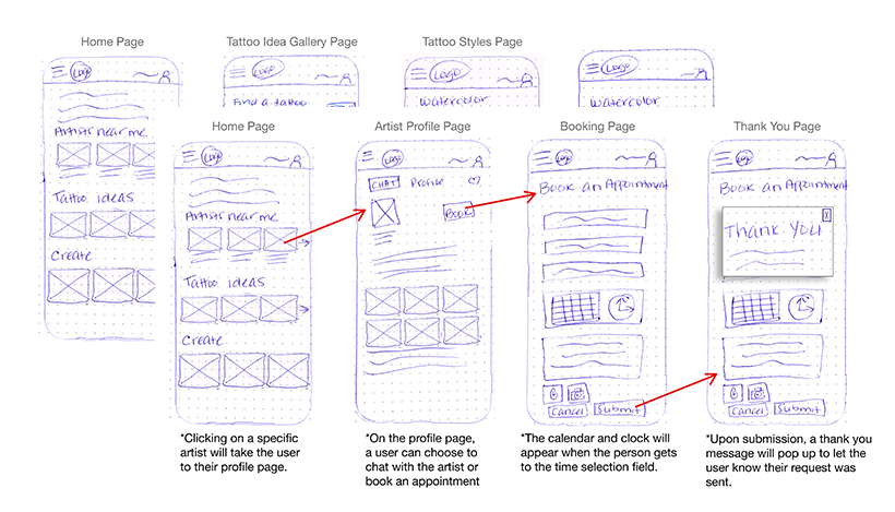
Low fidelity wireframes of InkTank
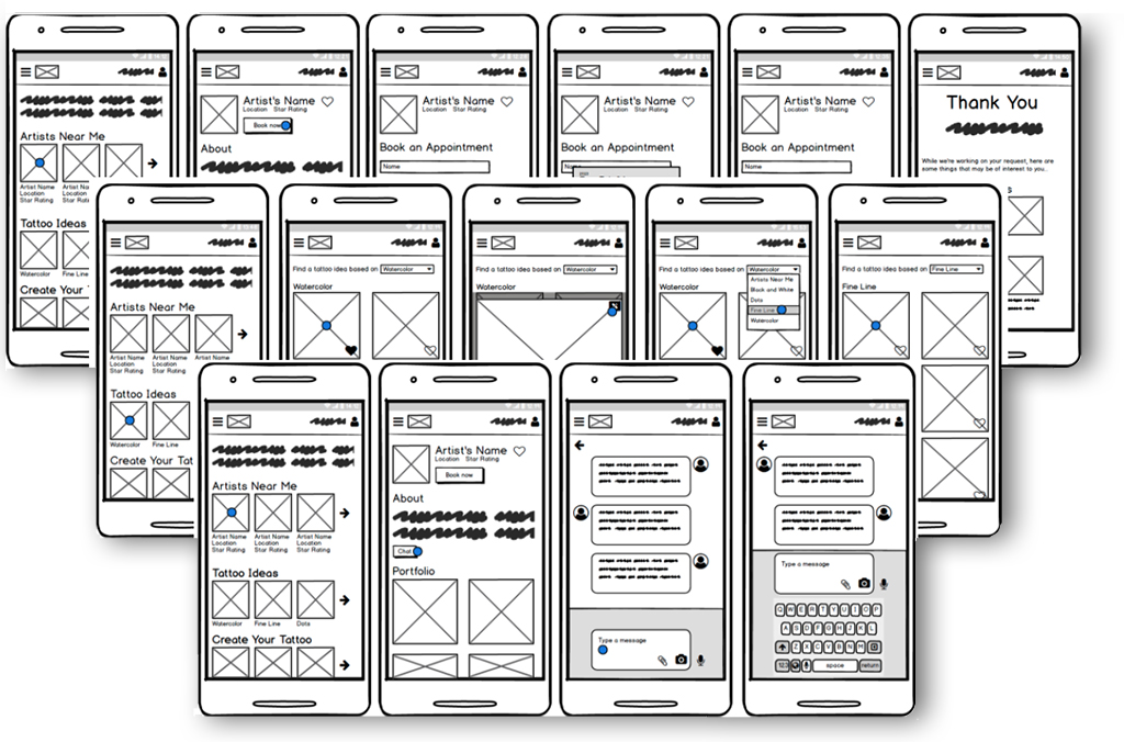
Mid fidelity prototypes of InkTank

Usability Tests
I did two moderated remote tests using Zoom and four moderated in-person tests.
Initially, I was going to use Skype to record the session, but after some technological difficulty, I switched to Zoom. It was much easier to use and worked perfectly for what I needed. I was easily able to switch control of the screen by giving the participants the link before they shared their screen.
For the in-person tests, I used Recorder, which is a native app on my phone, and my Pixel 3a to conduct the test. My prototype was built on Adobe XD, which was easy to share and use. As I had never used Recorder before and wasn’t sure how I’d be able to use my phone to both record and test a prototype, I used a second phone (a Galaxy S7) and its native recording software to record the first couple of sessions, just in case. It turned out that the Pixel 3a was able to handle recording and the prototype in tandem, so I ended up not needing the second phone for the other two tests.
Participants
I tested four people who fit the user personas I have created. As the app can be used by anyone, including people who are toying with the idea of getting a tattoo, I also tested two people who don’t fit the persona in order to test the basic functionality of the app itself.
Findings
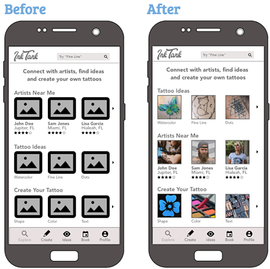
Issue 1: Frustration that all of the images were the same (high)
Suggested Change – Replace the placeholder images with colorful images that will represent the real images once the app is completed
Evidence: Three of my participants mentioned being confused as to why the images all looked the same
Issue 2: Participants wanted to click on the Tattoo Ideas gallery first (medium)
Suggested Change – Move that section above the Artists Near Me section so it’s easier for them to click
Evidence: Three of my participants said the first thing they would want to do in the app is click on Tattoo Ideas
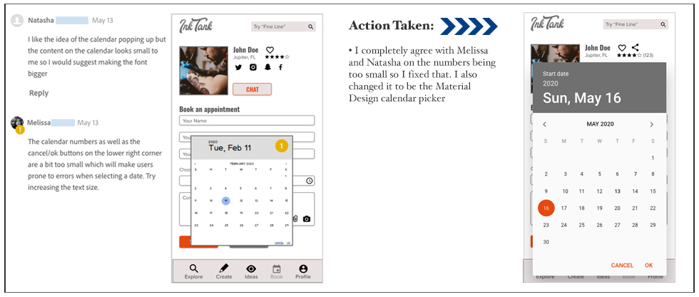
Issue 3: The heart is too small for people with bigger fingers (high)
Suggested Change – Make the heart a little bit bigger and move it further away from the box so it’s easier for people to click on
Evidence: Two of my participants suggested it might be a bit hard for people with big fingers to click on the heart
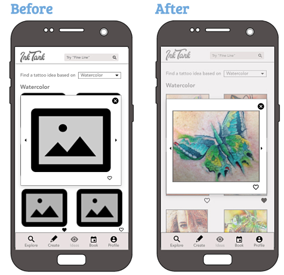
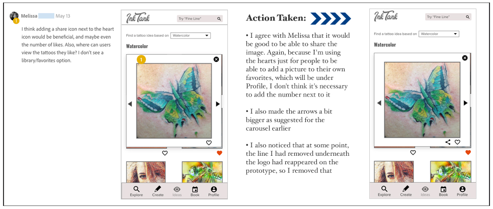
Issue 4: Arrows should make the image bigger (low)
Suggested Change – Once the app is in production, the user will be able to use their fingers (on mobile) to make the image larger. For the prototype, using a real image as the thumbnail and then showing the zoomed in image when you click to see it larger should address that issue.
Evidence: One participant stated she thought the arrow would allow her to see larger sections of the image, as opposed to going to the next image.

Refine
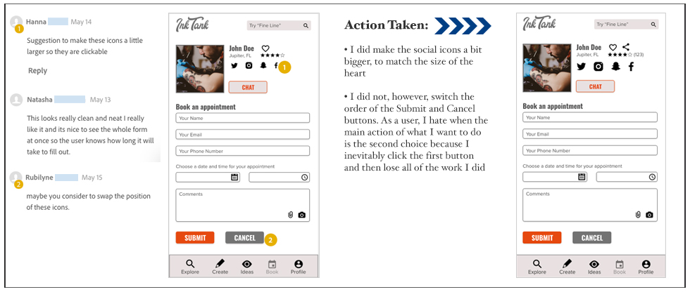
Feedback
• Five of my peers reviewed my Adobe XD prototype (I have removed their last names to protect their privacy)
• I got a total of 29 suggestions over the course of 15 screens
• One issue I ran into is that I misunderstood how my peers would go through the app. I thought they would actually use it (by clicking through the app’s links as opposed to scrolling through each page), so I didn’t include the Splash page or Sign Up page in my prototype to make things easier for them. Instead, it appears they scrolled through each page using the arrows at the bottom of the prototype. I did tell them when I requested their help that they would be entering on the Sign In page, but I see, based on their comments, that I should have included all of the pages for review.
• There was a lot of love for my logo, some great suggestions that made my interface better and also some suggestions that seemed more like personal opinion, so if only one person suggested it and it differed from what I’d envisioned, I kept it as is.
What I learned
New hypothesis
We believe that by building out the Create Your Tattoo section of the app for InkTank users we will achieve a one-stop-shopping app for people interested in creating and getting a tattoo. This hypothesis will be tested once the section is built, a new script is constructed and we do user testing with the new section.
Specific Improvements
I think that the app has a lot of possibilities for new features that can be added. For instance, in addition to creating a tattoo, the Profile page needs to be built out. That would show users which items they favorited, any tattoos they created within the app, perhaps a chat history and upcoming appointments. I’d also like to see a way for the appointments they make to pop up on the screen somewhere on the app and maybe add a notification on their phone or calendar to remind a user that they have an upcoming appointment.
User Testing
User testing would continue as I add or change features. One of the things I would change within my user testing is tweaking the tasks. It seemed the tasks I assigned people were very easy and were completed more quickly than I was anticipating. I would also like to figure out how to come up with better questions which will allow me to get more in-depth information from users regarding what they really want or need from the app.
To see the completed prototype, please visit InkTank
For more information about InkTank’s app, please visit InkTank’s Design Language System
-
InkTank